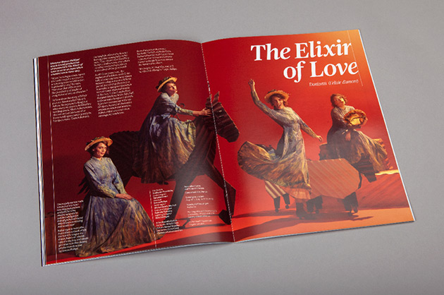
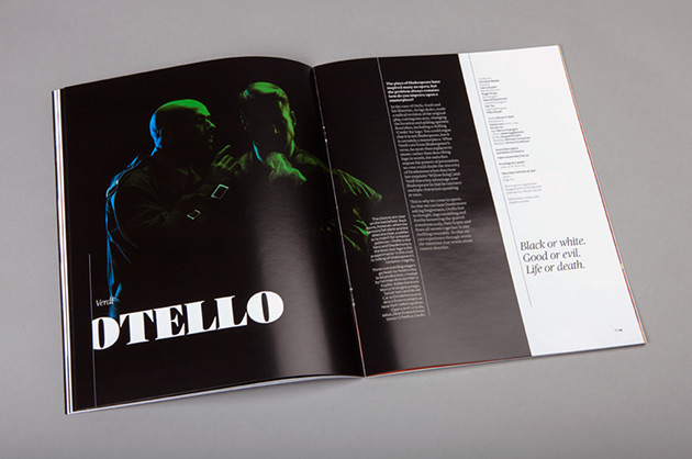
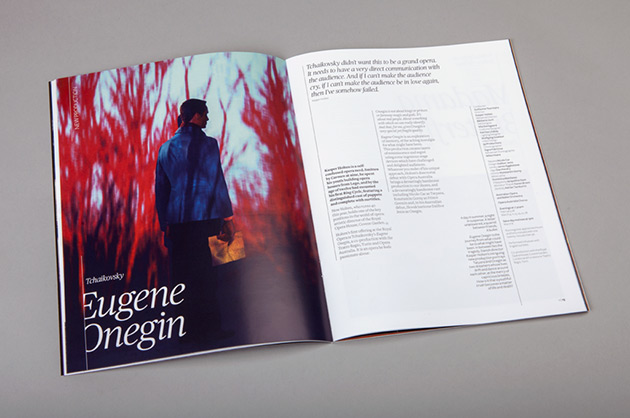
Opera Australia is Australia’s national opera company and arts organisation. Each year it hosts over 600 performances in venues across Australia and Asia including Sydney Opera House and The Arts Centre Melbourne. Interbrand Sydney were asked to breathe new life into their brand to attract new audiences.
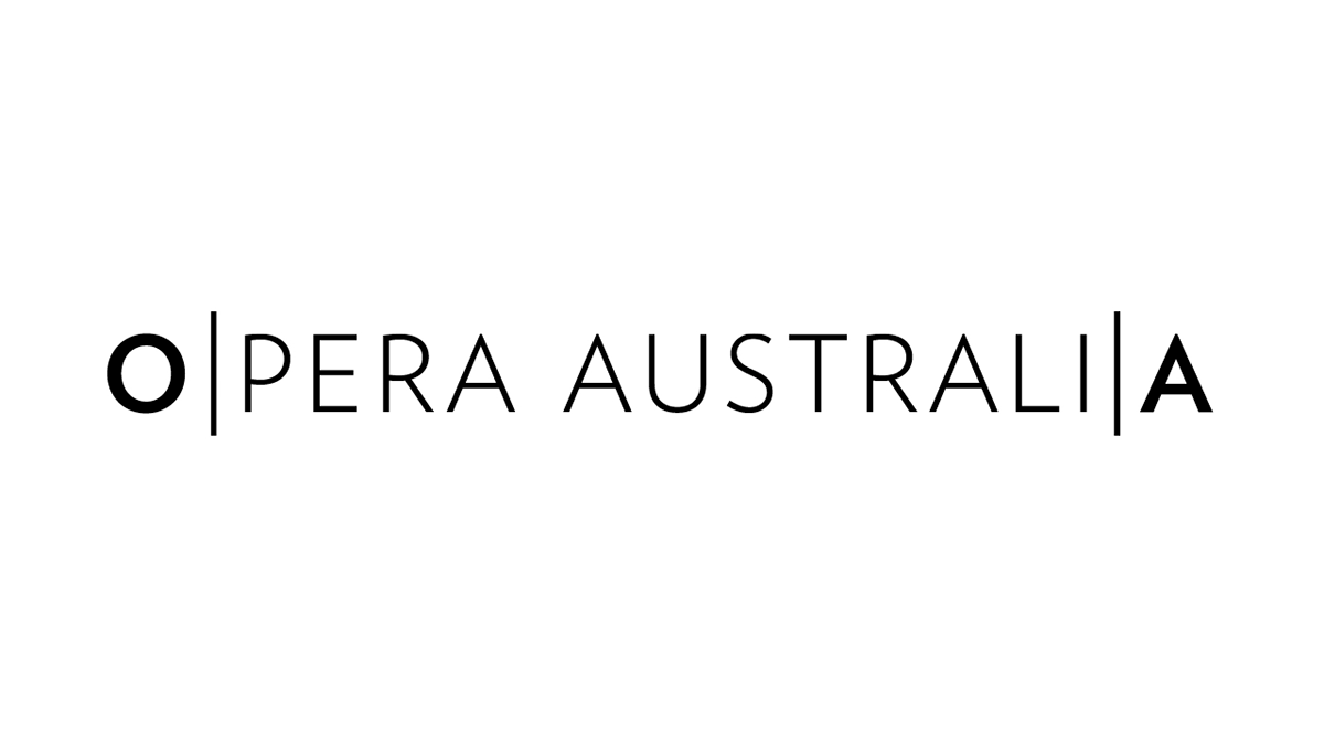
A logo system that could open up opera was devised. From OA, to OPERA, to OPERA AUSTRALIA, the identity expands to contain the rich and diverse range of activities the organisation represents.
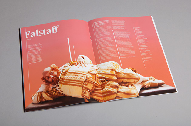
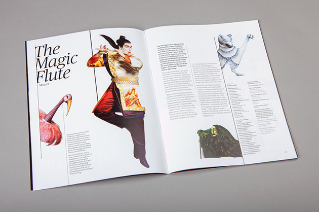
There’s so much more to opera than just the performance on the stage, and this new brand seeks to express that opera isn’t one-dimensional — it’s multi-dimensional. The costumes, the sets, the stories, the music, the emotion, the stars, the venues, etc. We expressed this by introducing vertical bars, based on musical notation, to separate the different dimensions of opera. Bars change thickness, vertical position and pace to represent the music. In motion, they move at different speeds, representing different instruments and voices; overlapping each other to open up and wipe content in and out.
Find out more about this project on Interbrand Australia's website.
Executive Creative Director - Chris Maclean
Design Director - Ami Gainford
Designer - Eric Ng
Motion Designer- Mike Tosetto
Motion Designer- Mike Tosetto